The powerful, conversion-boosting features that set Art Storefronts apart as the only eCommerce platform that focuses on the science of making art sales happen.
If you could create the ultimate experience to sell art online, what would it look like?
One could only attempt at doing so after analyzing the leading online art retailers like Art.com, UGallery.com, and Saatchi Art — all companies selling millions of dollars of art online (Yep, this includes original paintings, limited editions, as well as open editions).
For example, all of these websites have live 3D previews.
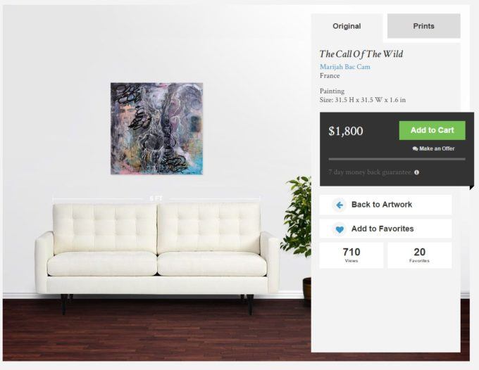 All of them have the critical in-situation “Wall Preview” tool.
Needless to say that if the leading art-selling websites are using certain tools to maximize their art sales then you should too.
When is the last time you compared the shopping experience on your website to one of the industry leaders? The most successful photographers and artists selling online do it all the time.
But there’s more to it than this.
You would still need to study the latest and greatest eCommerce techniques and make sure your site is using them.
Always.
This topic is so deep and daunting that entire books, blogs, departments, and consulting firms have been built around it.
These days, you don’t just toss up a website with ecommerce capability and assume that you just did a great thing for your business. You very well might have done something terrible for your business, because
not all eCommerce stores are created equal.
Every platform is different and your sales performance will either blossom with it or be limited by it.
In this post, we will highlight 18 of the main conversion-boosting features that we’ve implemented at Art Storefronts that are all thoughtfully designed to help you sell art online.
We make no bones about the fact that we are the only eCommerce platform solely dedicated to this topic.
 A topic that desperately needed to be addressed given that more art is now sold online than in galleries and that online art platforms are cannibalizing offline art sales.
(Don’t take our word for it. Read the 2015 Online Art Market Report by Hiscox).
These are not in any particular order, so take your time but make sure you read them all.
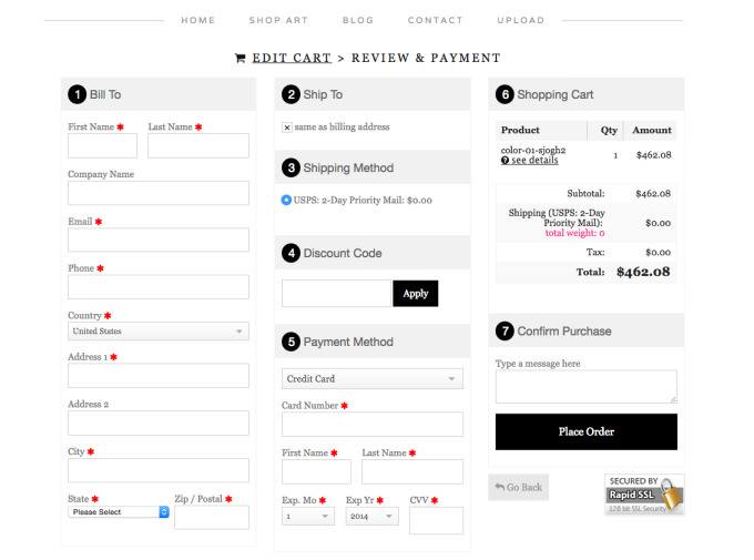
1. Single page checkout for guests

It’s all about less text, fewer clicks.
The internet is full of case studies that highlight the impact this simple change can have.
One of our favorites was run on the Vancouver 2010 olympic online store. They tested the single checkout page and found…
The single page checkout process was the clear winner and led to lower cart abondon rates. Successful completion rate for the entire checkout process increased by 257.26%. Overall site conversion rate increased by 0.54%. We also observed some unexpected improvements during this experiment, like an increase of 8.54% in the average order value!
The fewer steps you require your prospects to go through in order to checkout, the higher your conversion rates will be.
Rather than forcing your visitor to go through a series of steps to enter in their billing/shipping/credit card and select their shipping method, we do it all on one convenient page. This leads to less shopping cart abandonment, and therefore higher conversion rates.
2. Fewer checkout steps for logged in users

The only difference between #1 and this is that logged in users create/select a shipping and billing address in advance, but they then get led to a single page checkout for the rest of the information. This leads to less shopping cart abandonment, and therefore higher conversion rates.
3. Size flexibility

Choice is key.
A recent report from The Nielsen Co. showed that a lack of variety drives away consumers.
Nielsen surveyed consumers in more than 21,000 U.S. households whereby more than half said that reduced product selection in a given retail store causes them to shop elsewhere.
When selling art online, photographers and artists regularly drive away consumers by imposing a narrow range of options and forcing the consumer to choose between them.
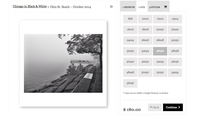
As is noted in previous blog posts about the importance of options, we make it incredibly easy to add whatever sizes you would like to offer, small to large, to make sure you never miss a sale. This leads to higher conversion rates.
4. Media flexibility

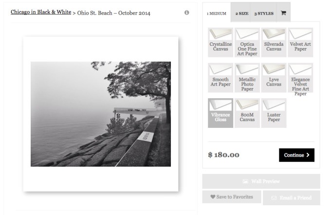
We also make it incredibly easy to offer any media type you want. Canvas, photo paper, smooth fine art paper, metallic paper, metal, wood, etc.
Again, you never know what medium the consumer, interior designer, or any other prospect already has their heart set on. What we do know is that people arrive at websites already knowing what medium they want. If you don’t offer the medium, you’ll lose the sale even if the customer loves your images. Now, you may not want to offer every media type; but by having the ability to offer a wider range of media types, and to try different media types with ease, you are empowered to capture every possible sale.
Your media type offering should reflect what THEY want, not what YOU want. This leads to higher conversion rates.
5. Finish Flexibility

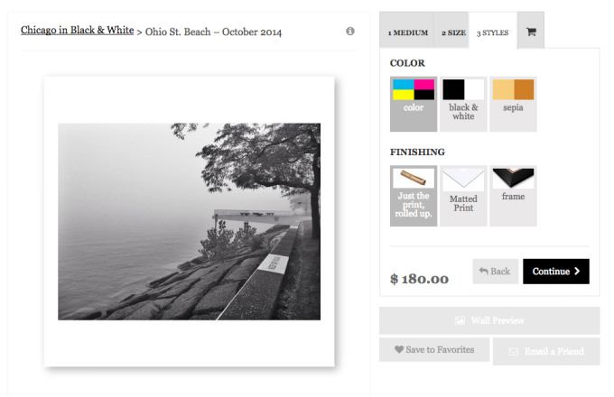
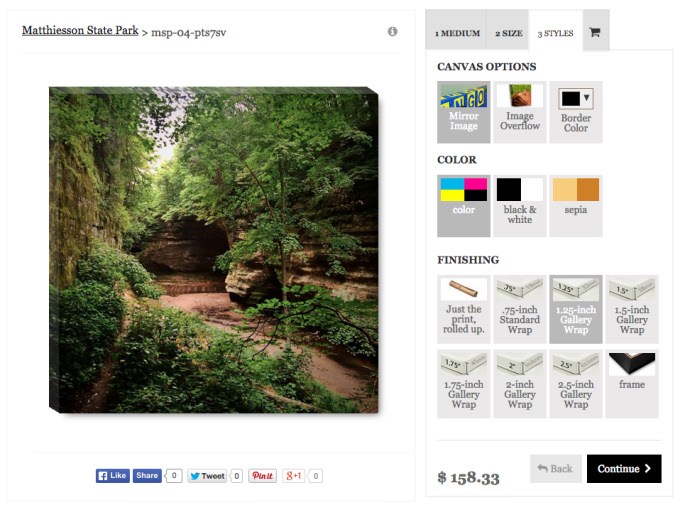
Offer a print rolled up in a tube, gallery wrapped, matted, framed, or whatever options you want. By giving your customer flexibility, you increase conversion rates.
For example, too many artists force their customer to buy a gallery wrap when the customer only wants the print rolled up in a tube because they plan to get it stretched and framed themselves (and feel more comfortable doing so).
In a case like this, when you don’t offer a rolled up in a tube option, and instead force your customer to pay for a gallery wrap they don’t want or need, you simply lose out on sales.
Given the variety of consumer desires when they go to purchase any given print, you can’t afford to force your customers into boxes that you think they should fit into. Instead, your offering should reflect what THEY want.
6. Option tooltips

Navigating eCommerce websites can sometimes be confusing.
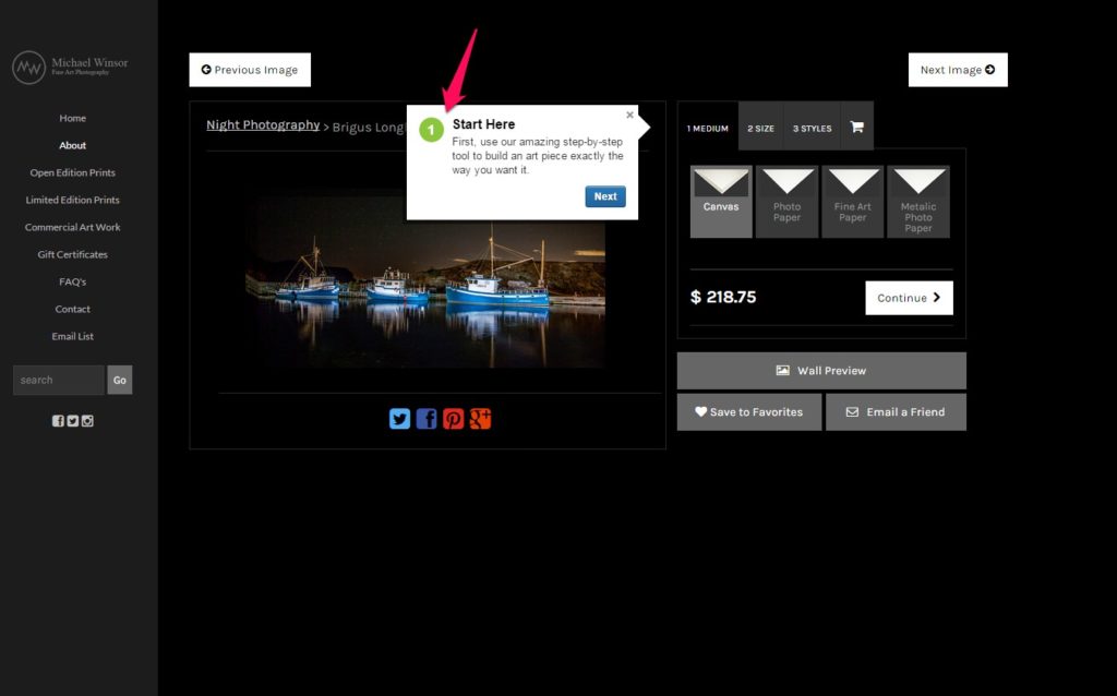
We take the guesswork out of navigation completely by offering pop up tool tips.
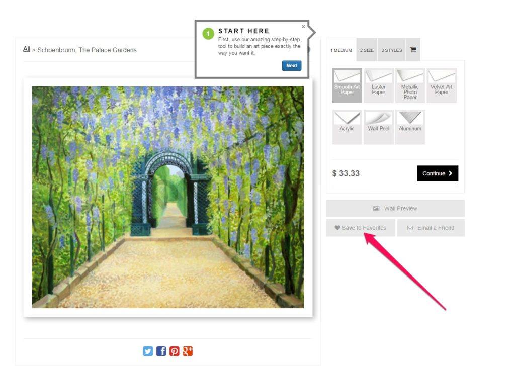
These tool tips will guide your buyer through all the steps and options available gently nudging them towards checkout.
This feature both increases your conversion rate as well as eliminate customer service emails.
7. Display teaser prices

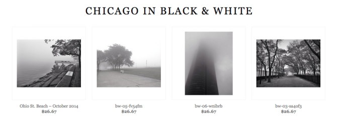
Teaser prices are the prices that can be displayed to a prospect while they are perusing through a gallery of your images.
We use the cheapest option that the image can be printed and purchased, and display it. The purpose is to give the prospect an idea of the lowest price they can receive if they want to purchase the print (they don’t know this is the lowest price; this is a marketing strategy).
Question the importance of this? The #1 rule in retail is that you ALWAYS display a price. Have you ever been shopping, looked for a price tag, and then lost interest in purchasing the item? The same idea applies here. Display teaser prices, and get your prospect to think “hmm…I can afford that”, so they click into the product and start examining the options and playing with the tools in your storefront – which are all there to encourage them to buy.
8. Live 3D previews on media types

This is just merchandising 101.
Merchandising refers to the variety of products available for sale and the display of those products in such a way that it stimulates interest and entices customers to make a purchase…
It’s the second part of that definition: display of products in such a way that stimulates interest and entices customers to make a purchase that is at the heart of online merchandising.
If you show a decent representation of what the print will look like, your customer will be more likely to buy. For example, terminology like “gallery wraps” are obvious to you, but to many novice art buyers, they are not.
Showing them a 3D preview of a gallery wrap gives them an immediate “Aha! That is what I want” and they can then proceed with the buying process. If you offer matted prints, wood prints, metal, etc. — you can show live 3D previews of these in the ASF platform, and all of these will help you sell more.
9. Live framing previews

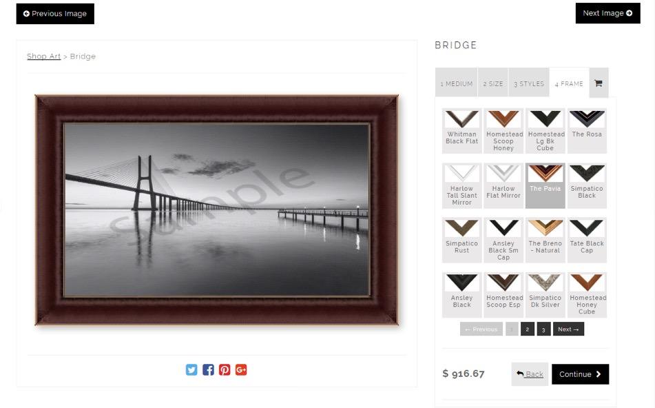
If you sell frames, showing them live 3D preview of the image with a frame will work wonders in helping you not only sell the print, but sell the print with a frame.
All in all, live 3D previews will help you convert more casual visitors into buyers and if you sell frames, well, its going to help you sell many more than you are right now.
10. Wall preview tool

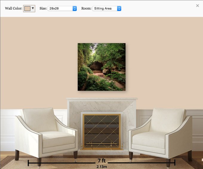
This is a designer tool that will allow your customer to see a preview of the print on a wall in various rooms settings; living room, restaurant, hotel lobby, conference room, nursery, and more.
In addition, they can change the size of the print and there is a horizontal measurement that will allow them to get a sense of scale.
Even further, they can change the wall color to match the wall color of the exact place they plan to hang the print. All of this is designed to solve the unanswered questions that stop people from actually making an online art purchase.
11. Email a friend tool

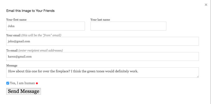
This tool specifically deals with the unique case when a visitor cannot complete a purchase because they need to run it by another decision maker, such as their husband or wife, before they can.
The “email a friend” tool allows them to send each image in a beautiful email, in seconds.

But even better, the image in the email links directly back to the buying page where the other decision maker can immediately see live 3D previews, and use the designer tools to view it on their wall with a specific wall color, and put both of them in a position to complete the sale.
12. Unsold Carts

If you’ve never ran an eCommerce store before, you wont believe how many customers add items into their shopping carts and never complete the sale. These are called unsold carts. They usually happen because buyers get distracted during the buying process (maybe their phone rang right when they were shopping).
Having a strategy to pursue these unsold carts is an easy way to increase your sales. Most of the time, if you just reach out to these folks you’ll find that they thank you for reminding them that they had an order going.
With others, you might email them a discount code 1 week later to complete their purchase. Who knows, one of these unsold carts might turn out to be a new great customer. Whatever strategy you choose to use to pursue the unsold carts, this tool is immediately at your disposal to increase new your customer acquisition and maximize the orders that are coming in.
13. Resale Certificate Submission

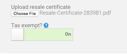
Some customers are tax-exempt businesses, and you need a way to let them order from you without being charged tax. Amazingly, right within their customer account on your website, the customer can submit a resale certificate for approval.
You will receive an email notification that a certificate needs approval, whereby you can go directly into your contact manager and review the certificate. If it looks legit, right there, you can toggle the option to give them tax exempt status, and they can now buy tax exempt. Another great side benefit is that you’ll have a nice convenient place where all of these resale certificates are stored.
By making it easy for tax-exempt customers to order from you both now and in the future, you’ll cater to this unique audience in a way that other businesses cannot, and this will help you acquire and retain these types of customers.
14. Add chat tools

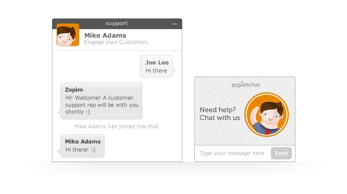
Adding a chat tool is a very effective tool to help you find out why your customers are not completing their purchase, and we make it easy to add widgets like this in seconds. Usually, the reason people don’t complete a purchase is because they have a simple unanswered question or a some fear they need clarified.
A chat tool helps bring these questions to the surface, and once you have them, you can modify the content on your website to address these questions and concerns. Pretty soon, the amount of questions you receive diminishes or disappears completely, and your conversion rates increase because people who otherwise would not have completed a purchase actually do.
If you’re thinking that “I don’t have time to manage a chat tool, I’m not around all the time!”, don’t worry. Every chat tool these days is designed so that when you’re offline, the chat tool becomes a contact form.
Some suggestions:
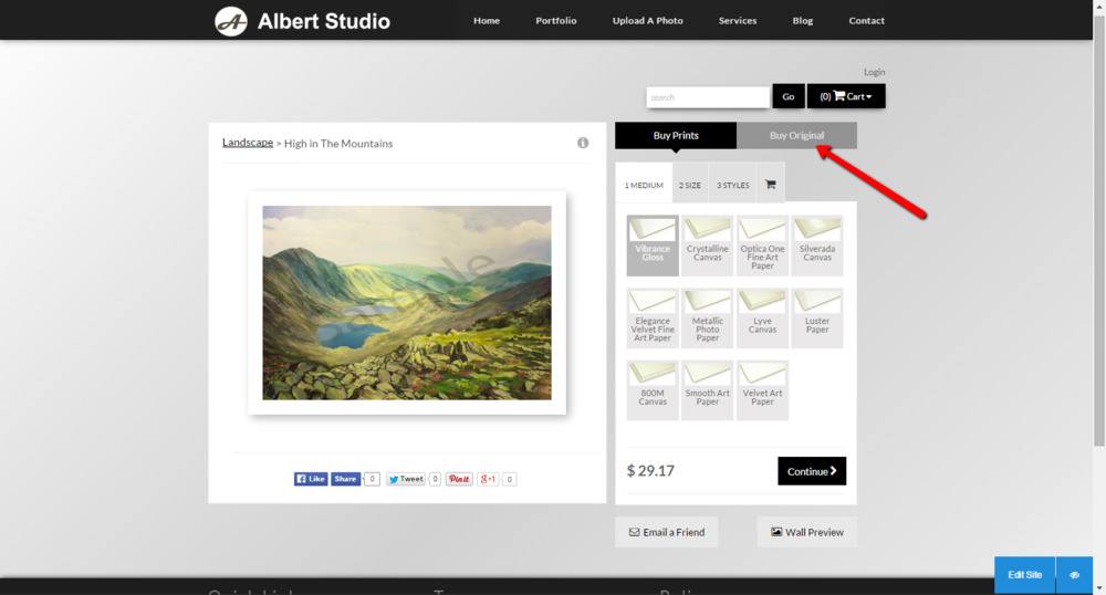
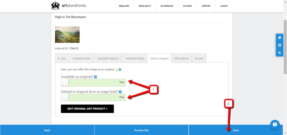
15. Sell Any Image as an Original, as a Print, or Both – All on the same screen

The leading art retailers like Saatchi Art sell prints and originals on the same screen. Makes perfect sense, doesn’t it? Consumers will find an image they like and will want to see every way they can buy it on one convenient page.
We have made it dead simple to sell art the way you want to. You can sell it as one off originals, offer the original and prints, and anything in-between.

16. Minimalist design

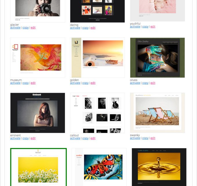
All of our themes are thoughtfully designed using the minimalist design strategy (learn more about minimalism here ). A main facet of minimalism is the concept of “less is more”, which is critical in the art industry.
Minimalist design allows the main image on the page to take center stage with no other elements competing for attention. It is how most of our walls look where we hang art, and it is why museums have large white walls.
Let the image take center stage. Minimalist design with artistic websites keeps the customer undistracted and on the path to completing their purchase.
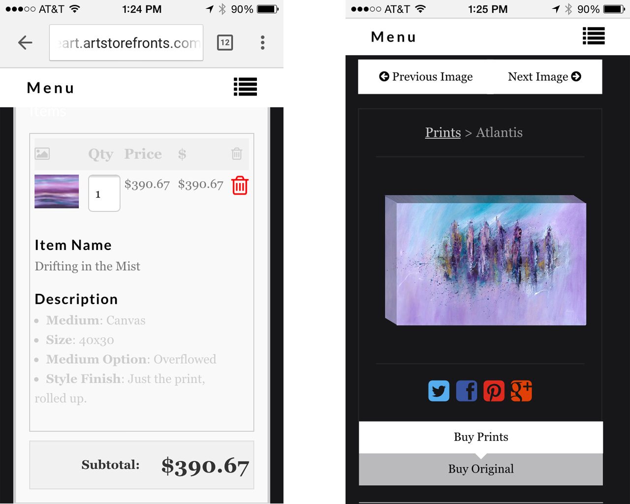
17. Mobile & Tablet ordering

People are buying art from mobile and tablet devices, and they’re doing it right on our customer websites.
This is obviously a segment that is growing each and every day. If you don’t have mobile and tablet eCommerce capability, you’re losing every potential sale from shoppers using these devices. In other words, you have a 0% conversion rate with this audience.
Equally important, google will penalize you on the search results page when your site is not up to mobile/tablet standards.
18. Favorites

When visitors save one of your images to their “Favorites”, it allows them to essentially create their own gallery, or “idea board”, of all the possible images they like from your website so they can view or buy them later.
During this process, they are asked to create an account which means you get a new email address.
And since 10 email addresses usually equals 1 new customer (when marketed to), this is a really good thing.
Favorites keeps visitors on your website and accommodates the shopper who is unsure and needs to run their choices by another decision maker.
For example, it might be a wife who has a few ideas about how to decorate their living room but wants to show the images to her husband.Rather than having to go home, come back to your website and hunt down each image separately (and likely forget where each image she liked was located), she can conveniently save them to her favorites and immediately go over them with her husband later. Once implemented, it’s easy to see how this functionality will translate into more sales happening on your site.
We take favoriting to the next level by accommodating the interior designer level of client, who may have many projects going at once. With our tool, these folks can create separate favorite lists and they can save images to multiple lists all in one shot.
This, along with the wall preview tool, means you’re site is doing about as much as it can to accommodate interior designers and higher level clients.
19. Social Pro

Given the profound impact that social media is having on the art market,
Social media is likely to play an important role in driving future online sales. 41% of respondents said they discovered an online art sales platform through social media (up from 33% last year). Facebook and Instagram are considered the two most important social media channels in the art world.
2015 Hiscox Report
social pro is probably one of the most powerful features we provide.
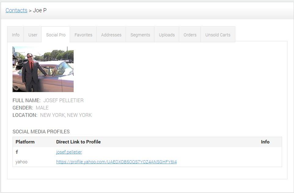
With just an email address, our algorithm will immediately show you the social profiles created by that person with that email address. Which means, you can immediately click on the facebook profile and become friends. Hands down, this is the most powerful way to increase your facebook audience and build sales over time from your social media presence.
You see, our software provides you with a contact manager which is where all your customer accounts and email addresses are organized. Every time a prospect fills out your contact form, a contact for that person is created in your contact manager. Every time a customer places an order, a contact also created. Every time someone registers for an account — even if they don’t place an order — such as when they want to save images to their favorite list, again, a contact is created.
As these contacts stack up within your contact manager, you can (and should) continually use social pro to immediately become facebook friends.
Now, with a large and growing facebook audience you have a way to constantly keep your images fresh in your customers’ minds.
Which means when that day comes where they have a need for art, you’re one of the first people they think of, and hopefully they remember a specific image you posted that they love.
This is the day they convert into a customer.
20. ConversionScience™


This is one aspect that isn’t an actual feature you or your customers will use – it’s something we are doing every day, and it’s something that differentiates us as a company.
We have an eCommerce conversion team — what exactly is a conversion and conversation rate optimization — that are constantly running scientific tests to find ways to increase art sales for everyone on our platform. Many of our findings and case studies are right here on this blog – read them.
This is why our platform, as it exists today, is just better at selling art than anything else.
This is partly because there isn’t any other platform or company who is focused on doing an amazing job at actually selling art.
It’s pretty much the most exciting feature of our software (if you ask us anyway). More than fancy jargon or a name it’s a commitment.
Every day we are focused on empowering our customers to sell more art.
Every day we are testing new and different features to help our customers sell more art.
This is not going to stop.
Every day we are getting better.
Which means every day you are getting better too.


 All of them have the critical in-situation “Wall Preview” tool.
 A topic that desperately needed to be addressed given that more art is now sold online than in galleries and that online art platforms are cannibalizing offline art sales.