Why Your Site Visitors Aren’t Buying Your Art (And What to Do About It)
Laguna Beach, California is one of the most vibrant art communities in the world.
Located right on the coast, you can literally walk the streets and visit over one hundred art galleries in just a few hours.
As a fan of art (and an occasional art buyer), it offers a truly unique experience any time or day of the week that you visit.
Just head downtown, grab some lunch, walk in and out of art galleries, and just take it all in.
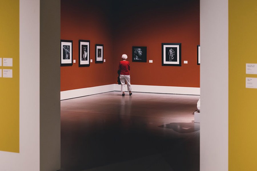
Whenever I decide to walk into an art gallery, I am usually warmly welcomed and encouraged to experience the art at my leisure.
Truth be told, I pretty much never walk in with the idea that I am going to buy anything. The main reason I walk into a gallery is for the visual and emotional experience.
Despite the fact that I didn’t walk into the art gallery with the intention of buying (like I do when I go to the supermarket), I know where I am:
- I am in a store
- I am in a place where things are for sale
- I see price tags
- I know that this is a business
- A business that is offering fine art for sale
- A business that I can come back to later if I have some open wall space
So why am I pointing this out?
First, because this is the exact feeling and experience that your website should have, if your goal is to sell any art from it.
Second, because the majority of artist and photographer websites do not provide this experience. And this is one of the foundational reasons that they fail at getting anything going in terms of art sales.
Your Art Website Doesn’t Feel Like A Store
This problem is so widespread in the art industry, we sometimes use the word “epidemic” to characterize the significance of the problem.
We have no idea who advised or influenced so many artists and photographers to set up their websites in direct contrast to the art gallery experience, when that is precisely what they need to do.
In these unfortunately common cases, site visitors will arrive on the site and click around a bit, but find it unclear that they have arrived in a store. They haven’t been made aware that anything is for sale.
The experience on these portfolio-like websites is more like flipping through coffee table book, reading a brochure, or checking out a passion project or a display of talent.
Tranches of visitors reach the site, view some imagery, and leave with a feeling of admiration for the talent but without any thought of shopping now nor in the future.
Unfortunately, if your visitors don’t feel like they should shop, they won’t shop. The thought may not even pop in their head.
So what elements does your site need to have to make it feel like a store?
#1: Lead Capture
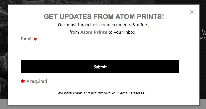
At an art gallery or an art fair, you would probably set up a mailing list sign-up sheet or a “drop your business card” bowl, right? So why not have the online equivalent on your website?
If 100 people come to your site, and if you have good art, media types, and pricing, you’ll get about 1% or maybe a little more to actually purchase your art.
So, what about the other 99 people?
The purpose of setting up a lead capture is so you can get 10-20% of the same 100 people to sign up for your email list.
Why is this important?
When a site visitor starts receiving romance content from you, you can start to tell them more about who you are and the work that you do.
It’s like having conversations with customers at an art gallery. Setting up your lead capture box makes those fruitful conversations happen.
That’s the basic idea, anyway. We go into greater detail on lead capture in this post.
#2: Homepage Layout
Next, ask yourself whether your home page is designed to drive sales.
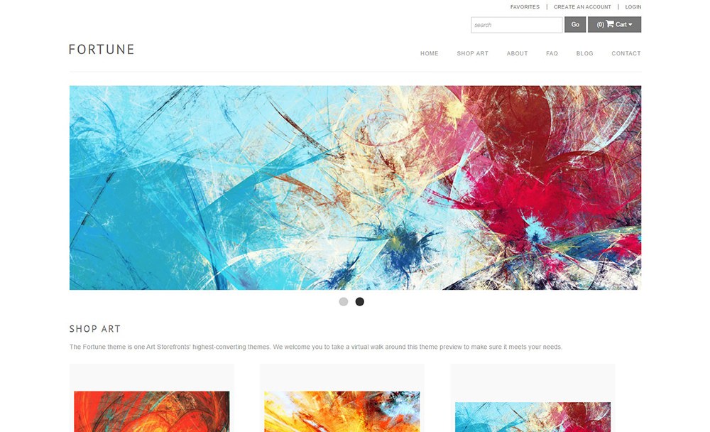
To do so, you should have “Shop Art” as a link in your navigation bar.
This will be one of the first things your site visitor will see and this is important because they’ll know that your site is a place where they can, well, shop for art.
You can have banners or not have banners. If you choose to have a banner, it shouldn’t be more than 500 pixels in height, so you can see down below it.
Basically, you just want people to know that they can scroll down. If you have big banner images, visitors might not know they can scroll past your huge image.
PRO-TIP: Make sure your prints and prices are clearly visible as soon as a visitor lands on your home page.
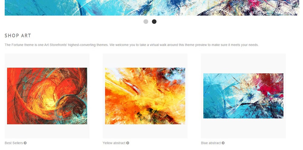
Then, below the banner, add another “Shop Art” (as shown above).
Placing “Shop Art” in the navigation bar and below the banner clearly tells a visitor, “I am in a store.”
Get more guidance on how to design your home page in this video post.
#3: Navigation Bar
Having a navigation bar with clear language is very important. Communicate to your visitors that not only are you an online store, but you also care about their user experience.
Here are the navigation links we recommend:
- Home – easy way for a visitor to access your home page
- Shop Art – organized way of presenting your visitors what categories of artwork you have available on your site
- About – tell your visitors a story about who you are and what you do for your customers
- FAQ – put yourself in your customer’s shoes and answer all questions your customers might have
- Blog – romance your visitors with interesting content and create a connection with them
- Contact – include text about when people should contact you and when they’ll typically receive a response
For more, you guessed it, check out our video on navigation bar design.
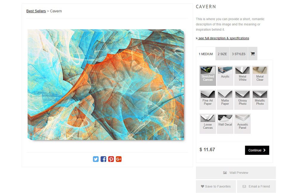
#4: Product Page Layout
Make sure your product page clearly walks the visitor through making a purchase.
They should be immediately presented with prices, options for media type, sizes, finishing styles, and a shopping cart icon.
You should also communicate every detail that’s important to a specific piece. “See full description & specifications” is the perfect place to store that information.
PRO-TIP: Use our Wall Preview tool to offer buyers a very practical way of picturing their purchase in their home.
We consider this experience in which the visitor can make a purchase with total ease to be not only ideal, but the biggest overarching difference between an ASF site and our competitor’s sites.
#5: Trust Badges
As shown above, trust badges live at the bottom of the page and serve to communicate to site visitors that they are on a safe eCommerce website.
Before you can expect a sale, the visitor has to know they are shopping with a trustworthy, legitimate business.
They are also a good opportunity to clarify your return policy and policy on archival materials.
To those ends, key badges to display include “Trusted Art Seller,” “Verified Returns & Exchanges,” “Verified Secure Website,” and “Verified Archival Material”.
For more on trust badges, see here.
Conclusion
Look at your website and ask yourself, is everything easy to find? Is there a clear message that my site is an eCommerce website?
If your answer to the questions above is “no,” it’s probably time to rebuild your website.
When a visitor comes across your page, make them feel like they’re walking into a physical art gallery, where things are for sale.
Be intentional with your design and you’ll be surprised with the results that will follow.
Sell More Art Online
If we can't teach you, no one can!


