Copywriting for Artists: What to Write for Your Home Page and Category Pages
The artist wears many hats.
One of them is copywriter.
If you’ve read any of the ASF blog posts on copywriting, you know the importance of writing persuasive copy that connects and engages with your ideal buyers on every page of your website.
Nowhere is this more important than the home page, which is usually the most highly-trafficked page on a website.
Your home page has a big job to do: it needs to give an overview of what your business does, link to your second-level pages, tell visitors how to get in touch with you, convey your competitive advantage or “meaningful difference,” and provide your visitors with a clear path to buy.
While some of these things will be supported in the navigation itself and on the other pages of your site, your home page sets the tone.
It’s the gateway to everything else.
Why Have Text on Your Home Page
Sometimes the biggest challenge is knowing what to write for the “lead-in” content area on your home page and category pages (the place where you can insert content above the images).
In fact, you might be wondering if you need to write copy for these sections at all. Is copy in these areas really that important?
After all, what’s on the page is self-explanatory, isn’t it?
Well, no.
No matter how amazing your work is, unfortunately, your art does not speak for itself when it comes to making the sale.
You need compelling copy that helps tell the story of who you are and what you do to make that happen.
Think of it from the potential buyer’s point of view. If she lands on your site and there’s no content, no story, no narrative of any kind to give context to what she’s looking at, why would she want to stick around?
A series of images with no copy to support them or share the romance of what the buyer is seeing, is just that – a simple, unadorned series of images, nothing special.
We’ve talked before on the ASF blog about writing client-focused copy that makes a connection with your ideal buyers, and that needs to happen on every page of your website, even if it’s just 2 or 3 lines at the top of each page.
Other pages of your site will require more copy than a couple of sentences, but that’s a blog post for another day.
And let’s not forget SEO. While people love beautiful images, a website needs copy and content to rank in search.
It’s definitely not all about the images; well-written, keyword-friendly copy and content, and other SEO considerations, are just as important for an eCommerce site as they are for a standard content-heavy website.
Plus, the lead-in area above the images on your home page and category pages is a great place to add a bit of personality and identity to your site, and/or include important “how to use my site” instructions, which further beefs up your SEO.
Writing the Lead-In Copy on Your Home Page & Category Pages
First, let’s address how long this copy needs to be.
There’s been a debate raging about short copy versus long copy since Al Gore invented the internet in the early 1980s.
The simple rule for copy length is this: you need enough copy to help people complete the #1 goal you’ve set for each of your website pages. (By the way, every website page needs a goal, otherwise, there’s no reason for it to exist.)
You may have decided the #1 goal of your home page is to get visitors to sign up for your newsletter, or check out your Shop page, or visit one or more of your category pages, so you write enough copy to make that happen.
If you can do that in 2-3 sentences in the lead-in area, given that you also have the space under your images for additional copy if needed, you’re good to go.
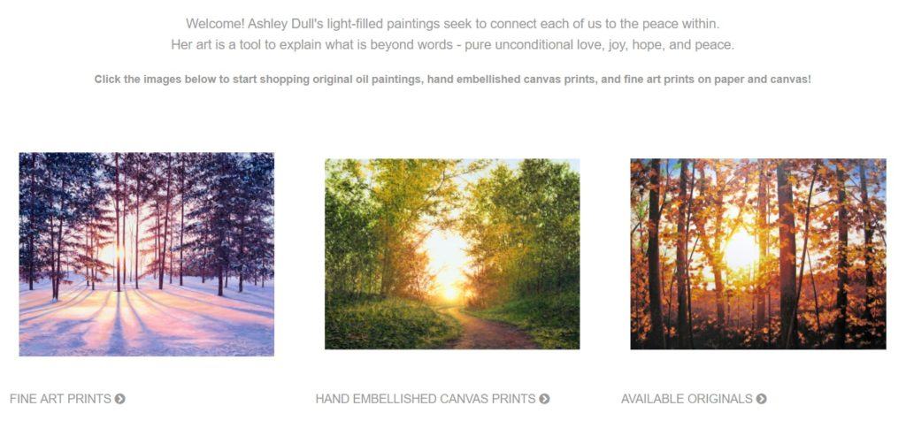
Here’s an example of an artist using the lead-in content area on her home page to give meaning and context to her art through copy:
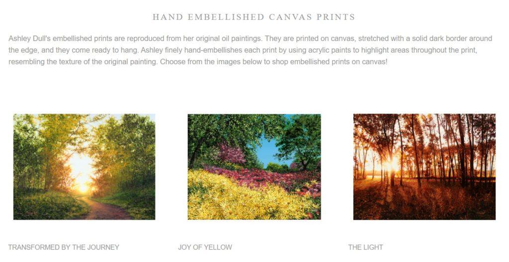
And here’s how Ashley Dull does that on her Hand Embellished Canvas Prints category page:
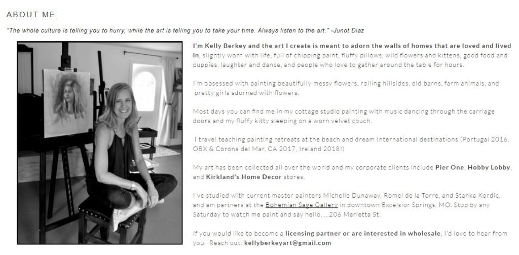
One little pointer here: I usually recommend writing web copy in the first person, so you may want to take that into consideration when you’re writing this area of your home page, category pages, and about me page.
In the example above, Kelly Berkey writes her “about me” copy in first person, which gives off a very personable and approachable presence.
Home Page Copy Examples
You don’t want to overburden your home page with too much copy, but for all the reasons outlined above, it’s imperative that you have some copy, however brief.
Here are three short excerpts of home page copy I’ve written for artists to give you an idea of how you might want to approach writing your own.
Keep in mind, the lead-in copy on your home page does not have to be this long.
In fact, the copy I wrote for these three websites was quite a bit longer than the excerpts shown below.
For a Fine Artist Who Specializes in Montana Landscapes and Western Themes
Tagline:
Wendy Marquis Art: Capturing the Rural Romance of Montana and the American West
Home page body copy:
Whether you grew up on a ranch, come from a rural background, or you’re a committed city dweller, you want art that reflects quintessential Western motifs in a contemporary way, and brings the romance of the American West into your home.
Hi, I’m artist Wendy Marquis. My work is a contemporary interpretation of old pickup trucks, Montana landscapes, farm and ranch animals, grain bins, barns, and other iconic rural Western scenery, but with a modern vibe. I like to say that I “capture rural romance.”
Home page call to action copy:
I invite you to view more of my work in my Gallery here, where you can view both prints and originals, or learn more about me here.
You’ll need to experiment to find out works best on your site, but in this example, the first part of the copy could be placed just before the images, and the call to action copy after.
For a Fine Artist Whose Work Reflects a Realist, Old-World Style
Tagline:
Diane Cardaci Art: Original Art with Timeless Appeal
Home page body copy:
Hi, my name is Diane Cardaci, and I work in the realist style. My art is lovingly created, one brushstroke at a time.
Welcome to my online home. I invite you to come in, learn more about me and my work, and stop to embrace the slow pleasure of art and beauty.
Home page call to action copy:
Sign up for my newsletter here and receive instant access to my 3 Step Guide to Mindful Art History Appreciation.
For a Fine Art Photographer Who Specializes in Landscapes and Lifestyles of the American and Canadian West
Home page body copy:
I’m photographer/artist JL Grief. I specialize in capturing images of the land, the people, and the lifestyles of the American and Canadian West.
Family ranch life, the cowboy, the horse, the wildlife of the west, Native Americans and the vistas they occupied – these are my subjects.
I am honored to have a chance to depict the important stories and traditions of the West and its people through my photographs.
Home page call to action copy:
I invite you to view my Galleries, sign up for my newsletter to keep up with the latest on my travels and new work, or learn more about me here.
Closing Thoughts
There’s a lot more than can be said about writing home pages in particular, but when all is said and done, you want to be sure your website makes it easy to do business with you.
Part of how you do this is by giving your potential buyers enough information about your work on your home page and category pages to get them interested enough to explore the rest of your site to find out more, and giving the search engines enough information to know what you’re about so you show up in search results.
Sell More Art Online
If we can't teach you, no one can!


