10 Web Design Mistakes That Are Costing You Traffic and Sales
Web design can be the hardest easy part of running an online business.
Sure, it only takes a few clicks to start up your new website using a pre-built theme and a user-friendly content management system like WordPress.
But what separates a functioning website from a thriving one?
There’s no “one simple trick to double your sales!” to be found here, but by making an effort to understand your online customer with our tips in this article, you can optimize the user experience to acquire future ones.
These days, every business is competing for market presence in the online space. The successful ones are implementing a variety of strategies, and avoiding making mistakes that needlessly push customers away. So, let’s get into it. Here are 10 easy mistakes we can promise are costing you traffic and sales.
1. Ignoring the “Above the Fold” Space
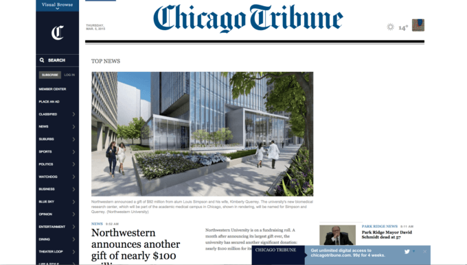
Old newspaper lingo gives us the term “Above the Fold.” It’s everything above the paper’s horizontal fold that the reader sees when first picking it up, or deciding whether to purchase from a newspaper box. As you can imagine, the above the fold content becomes a pretty big deal! Publishers and editors spend tons of time and energy making sure this high-value area goes to print with top notch material that’ll invite readers to purchase the paper or continue reading it once they’ve picked it up. And can you see that line of business people winding down the block? Those are advertisers, lining up for a spot above the fold.

The traditional fold
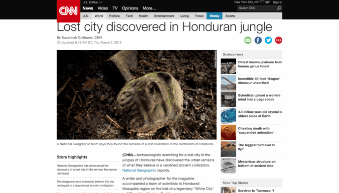
So what does the “above the fold” space have to do with your modern eCommerce website? According to basically everything we know about web user behavior – a lot! In terms of internet publishing, the new “above the fold” is really just the content your site visitors see immediately when they land on your website (without having to scroll down). A 2006 study by Jakob Neilson found that 77% of visitors landing on a website for the first time will not scroll before they decide to leave or continue forward.
And, while we’re throwing statistics at you, ConversionXL’s 19 Things We Can Learn From Numerous Heatmap Tests concludes, “Visitors spend 80% of their time focusing on the content above the fold. The material that’s most important to your business goals should be above the fold.”
The modern “fold”
Yikes, right?
Above the fold space is a big deal, but it’s not hard to figure out what to put there for your web page. Take a lesson from your own browsing habits. As a visitor to other websites, you likely use the above the fold space to quickly identify the concept of the webpage and decide whether you can get what you need out of it. That’s all we’re looking for as internet users: value, ease of use, clear information.
Make the most use out of your above the fold space by remembering that your site visitors are not up to speed on what you do and how you do it. Ease them into your world by providing them with the headline that will make them want to read the full story. Information here should be concise and offer a clear path forward for the visitor to engage with your content.
2. Missing Clear Calls to Action on the Home Page
What we’re really talking about with this “clear path forward” idea is a simple call to action: give your visitors something to learn or do immediately.
“Getting visitors to your website is just the first step. You also have to turn a decent percentage of those visitors into leads and customers.” –Corey Pemberton, What Is a Call to Action (and Why Should You Care)?
This is a lot like how we evaluate businesses at a shopping mall. You’ll walk in, take a look around, and based on that initial impression decide to either stay or move on. And once you find a store you like, one that gave you something to grab onto in that first look-around, you can bet you’ll be back next time.
How can you make your homepage a place that delivers that same great first impression?
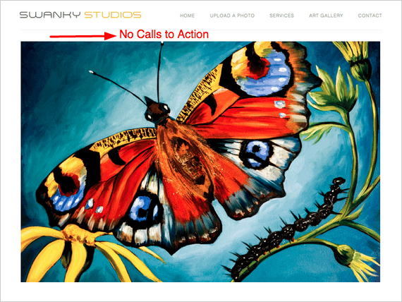
Let’s look at this example website of a fine art print studio:
Here’s a webpage with an eye for aesthetics, but not much else. This company could provide an intricate platform of top-class fine art printing services, and we’d never know! There’s no clear indication of what the core product or service offerings are, or how the company differentiates itself from competitors. Any info at all will only be gained by digging into the site’s other webpages, and if SEO can teach us anything, it’s that people don’t like to dig.
If the visitor hasn’t bounced already, they’re probably going to be left wondering where they should go next to track down the information they are really seeking – that probably means not your site, AKA a lost sale.
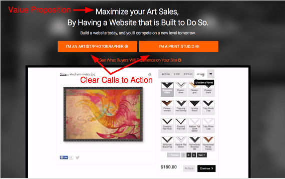
Now, let’s get this company’s homepage in shape by looking to highlight core products and services in the above the fold space. It’s time to roll out the figurative spotlight and direct it straight at the value proposition.
Here’s a new version of this page. Take a look at how it uses a very clear value proposition and calls to action to entice the visitor to further interact with the site.
Turning back to your website or company – ask yourself:
When a customer reaches my home page, how am I directing them? Are there helpful graphics or sections of content that actually provide information and tell my visitor where to go next? Is my most important information and call to action “Above the Fold”?
Every web page has a purpose, but not always a clear one.
3. Ineffective Home Page Title
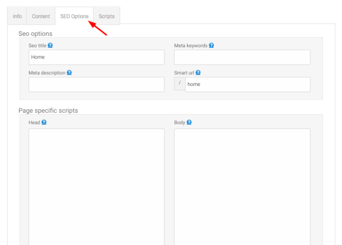
The SEO title of your home page is the single most important SEO tag on your entire website. It’s your chance to whisper in a search engine’s ear and tell them what your entire website and company are about. So while it might make sense internally to name this field “Home,” you’d be allowing Google and other search engines to basically ignore your website!
Make sure your home page title does a good job of describing your products and services. If Google understands who you are, it can better relay that information to potential customers searching for keywords in your industry.
If you want to expand this approach to further increase your search ranking, every single page on your website should have its own unique, descriptive SEO title. Look out for duplicate titles, th0ugh – if this happens, search engines will only count and index one of those pages, and not both. You could even be hit with a duplicate content penalty.
Titles should also be no more than 7 words, so make them count!
Using the Art Storefronts site manager, you’ll use the “SEO Options” tab to implement SEO information for a given web page.
If you want to improve your SEO over the long term, you’ll need to start thinking of your website as an encyclopedia for the products and services you offer, as well as the industry you serve. Sure, product sales may be your final goal, but that doesn’t mean you can’t be a content leader within your niche. Putting in the work to start up a blog or offer other helpful content to your visitors will pay off – search engines generally reward informational sites over shopping sites. Just don’t forget to stay on top of descriptive SEO titles!
4. Cluttered Upload Page
“When people are on your site, you don’t want to sidetrack them with a bunch of visual junk.” –KISSMetrics, How to Make a Landing Page That C.O.N.V.E.R.T.S.
Another mistake many web publishers tend to make is cramming too much information onto their upload page. Based on the data we see from hundreds of our fine art print studios and photo labs, websites that have a lot of extra text or images on their upload page see lower customer conversion rates. This means losses of hundreds, even thousands, of dollars on a daily basis.
Here’s a simple example. Let’s say you receive 50 new visitors to your website each day, and your average order size is $150. If your cluttered upload page is costing you 10% on your conversion rate, this means it’s costing you 5 customers per day.
5 customers x $150 per order = $750 lost per day.
That’s $22,500 in lost revenue per month.
Ouch.
When a visitor reaches the upload page, remember that they did so because they deliberately clicked an “Upload a Photo” link (or whatever text you choose to use). At this point in the process, they’ve already read enough information and trust you enough to have made the decision to attempt a purchase.
Knowing this, having extra images and content on the upload page just isn’t necessary. That same content could go to better use on other informational pages that your prospective customers will read while they’re still considering making a purchase with you. Putting this stuff on the upload page, it goes from “smart pitch” material to “dumb noise” that will push your upload buttons further down the page making them harder to find and distracting your customer in the process.
Worse, it could sidetrack them with new questions, thoughts, and concerns that delay or subvert the sale!
Since the entire purpose of the upload page is to allow the visitor to upload an image, get out of their way – remove the clutter and noise, and just let your customers buy from you. That’s the whole point, right?
5. Using Non-Traditional Theme Layouts
Web design is a dynamic, evolving beast – one that looks different today than it did 10 years ago. While many may be eager to be the first adopters of the next big trend in web design, be aware that balking the norm can cost you in traffic and sales. For most applications, turning to America’s top retailers can clue you into what approaches to layout are working well. Here’s a couple to avoid:
Center Justified Themes
Since most people aren’t accustomed to reading text that is center justified, using a centered theme makes reading content more difficult and leads to visitors reading less.
Vertical Navigation
We plan to address this topic in greater depth once we have collected more data, but our initial data is already showing that these websites are seeing lower conversion rates. This isn’t too surprising, just look at any major shopping website (the foremost experts on website conversion rate optimization), and you’ll find navigation set horizontally.
An example of vertical navigation
This isn’t to say each and every application of these non-traditional trends are wrong or will lead to decreased sales, but the data available does suggest you’re more likely to see increased conversion rates by keeping up with standards set by major retailers than by ignoring them.
For more on web usability and user experience, Steve Krug’s Don’t Make Me Think will give you easy-fix solutions to many of the most common design mistakes.
6. Offering Paypal as the Only Payment Option
This one’s simple. Having the capability to accept credit card payments is something that distinguishes credible, established businesses from everyone else when it comes to ordering products online. PayPal is a helpful convenience to offer, but requiring all customers use it can be seen as a red flag.
Even though you may be a small company, or even a startup, there is no reason you can’t accept credit cards. Stripe, who we are integrated with, allows you to set up a free merchant account (no monthly fees) and usually approves your account within a day or two. Then, you just pay transaction fees as you go, just like any other merchant provider. By adding Stripe, you can start accepting credit cards on your Art Storefront immediately, right alongside PayPal.
7. Distracting or “Noisy” Web Design
Art Storefronts purposefully empowers you with minimalist design because it is the single best method to ensure that the images viewed on your website are the absolute focal point at all times. Whether your visitor uploaded their own image or is viewing an image for sale in your online gallery, minimalist design ensures that these images never have to compete with background colors or any other design elements that distract the visitor from the image they could potentially purchase.
Let’s dig deeper and look at a few statistics gathered from user experience studies:
- First impressions are 94% design-related. “Studies of user behavior have found that visual appeal and website navigation have the biggest influence on people’s first impressions of your brand.”
- 68% of users leave a site because of poor user-centered design (UXTraining.com)
- 48% of people cited a website’s design as the number one factor in deciding the credibility of a business (IronPaper.com)
Image driven websites, such as those used by print studios and artists, will often achieve high conversion rates from simplifying their website design – it certainly adds a modern, aesthetic boost, too!
Look to the top performing online art retail sites to confirm this. Art.com has a white background on their shopping pages for the same reason that museums have white walls: the image should take center stage.
Our data also shows that print studio websites who have changed their background color to a non-neutral color, or added square background colors to their navigation menu, or a background image, see lower conversion rates than those who do not.
If you plan to customize the design of your website, make sure you have a solid design strategy. Of the print studios who make design changes beyond what we provide with our templates, most use our themes as a starting point and then make modifications themselves or by hiring a contractor on websites such as Fiverr or Elance. Some of our print studios with larger budgets have hired third party companies to add a combination of custom HTML, CSS, and Javascript to make for some truly stunning websites with incredible user experiences (see customcanvasprints.com).
Like with any joining of art and business, the successful implementation of a design strategy is all about intent. Make each individual choice part of your company’s larger brand identity – avoid the arbitrary, pursue the meaningful!
8. Making Web Decisions Without Statistical Data
When running an eCommerce website, solid data should be a major guiding factor in your future design choices.
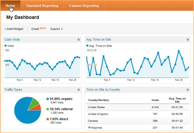
The numbers can help rein in your ambition by showing you plainly what is and isn’t working. Don’t be afraid to switch things up to feel out what your customers respond best to. To track response to your choices, Google Analytics is free and the standard for tracking and measuring website performance .
Once you’ve installed Google Analytics, you can set up conversion goals and start receiving baseline data for how your website is performing. Then, when you think you want to make a change (like adding or removing text to your upload page, for example), you can a/b test each version and see which performs better.
If you want to take your conversion optimization to the next level, implement Optimizely for a/b testing and Inspectlet to actually watch sessions of your visitors on your website. You can easily add third party widgets like these in the Site Wide Scripts section of your Art Storefronts site manager.
Jumping in to the world of analytics can be intimidating, but don’t be deterred – whether you learn yourself or hire out help, knowing exactly what your visitors and customers are doing with your site will help you improve it for them.
9. Limiting Purchase Options
This is one of the most common problems we see from low converting Art Storefronts websites, which we’ve documented in our article detailing the Top 3 Mistakes in Selling Art Prints Online.
Let’s say you’re a print studio that only offers very specific sized gallery wrap options because you buy pre-notched stretcher bars, such as 8×10, 16×20, and so forth. If someone wanted to purchase a 14×17 gallery wrap, you’d have no solution, so you have no choice but to limit your website options so that someone cannot purchase this size, right?
Not exactly.
Here’s the idea: you would never accept an order in person or over the phone for something you can’t produce, but on an eCommerce site you don’t have the chance to offer a substitute product or a discount for ordering a different item. Communication like this between customer and salesperson can be a major factor in retaining sales you would otherwise miss out on.
For example, Canvas on Demand will accept any image uploaded to their website and will allow you to order it in any size you prefer. Why would they do this?
First, their customer service team is capable of reaching the customer via phone or email if what they ordered is not offered, therefore retaining a large percentage of those orders by reaching a substitute agreement.
Second, because they operate with Customer Lifetime Value firmly in mind — knowing that the future business with this customer is most important — acquiring the new customer (not just the sale) is their absolute highest priority.
Third, because receiving real intelligence about the products, sizes, or options they don’t offer is the only way they can understand what they should offer. For example, say you received 20 web orders for 14×17 gallery wraps last month, this would be a good indication that offering this stretcher bar size could lead to more sales, and, by extension, more customers. Having the ability to obtain this type of information is a very effective way to start building your business based on real demand and feedback. Who better to listen to than your customers themselves? Play around with different offerings and test them for short periods of time, and use the information you gather to make better decisions on how to run your business.
10. Trying to Duplicate An Offline Business
“But my pricing MUST be this way! It’s just how it’s always been!”
We get it, when you’re first entering the online space, the most comfortable and logical thing is to make your new website a reflection of your offline brick and mortar business. The trouble comes when business owners are reluctant to adapt to eCommerce to the point that they’ll give up sales before learning to create an online business that works hand-in-hand with their pre-existing one, but doesn’t duplicate it.
Don’t worry, though, you aren’t alone. Every business makes trade-offs when they start doing business online. Software simply cannot duplicate all of the processes and procedures of an offline business, and you’re dealing with a customer that has the entire online marketplace open to them, not just their town or physical region.
Launching an eCommerce store is often the first time when business owners are forced to think about how they have always done things, and how to become better. One of the great parts about making the jump to eCommerce is that you’re joining a community of similar businesses who share a common set of operational tasks. The industry works together to solve them, and the solution reached is usually pretty darn good!
Keep an eye on distinguishing yourself from competitors, but don’t think you have to have a completely proprietary website in order to succeed. Use themes, plug-ins, and other pre-existing tools to complement your site and build a highly functioning, sale-generating machine! Most importantly, don’t stop looking for ways to do better online business.
Wrapping It All Up
Thanks for reading! We hope you’ve learned something valuable from this post that will inspire you to audit your strategy and look for ways to improve.
Check out the awesome resources we’ve linked to throughout this post, and as more data becomes available to us we’ll continue to update this article. We’d also be thrilled if you’d send this piece to someone else within your company, or a friend who might learn something from it too.
Finally, have your own solution to a popular web design mistake? Leave a comment below!
Sell More Art Online
If we can't teach you, no one can!

