The Must-Have Features To Sell Art Online with Your Website
Most artists' success as online art retailers is the result of several features all working together in unison to provide their visitors with an incredible buying experience on their websites.
So let's break it down -
What exactly goes into the perfect online art-buying experience?
It has to be interactive, allowing site visitors to properly visualize their potential art purchase.
It has to be personable, giving shoppers a chance to get to know the artist behind the work they’re considering buying.
It has to be logically optimized for the user experience, providing the customer with all the information they need to be confident in their purchase. Answering questions before they ask them.
For the past 10 years, online art retailer giants like Art.com have been working tirelessly to develop exactly this type of experience.
And it’s a pretty darn good investment on their part. According to the 2019 Hiscox Online Art Trade Report, the online art market hit $4.65 billion in 2018 – a 9.8% increase from 2017.

By 2021, they anticipate a market value of $9.14 billion.
Art retailers have recognized the shift, felt the pain from online art sales cannibalizing the offline market, and are reacting accordingly by offering a compelling online art-buying experience.
Meanwhile, photographer and artist websites have fallen behind – way behind.
If you’re an artist or photographer, and you have your own website but are disappointed with the lack of sales being generated from it, there is a very good chance that is the result of a lack of features.
Your site just doesn’t compete with the experience available with the big guys.
So what features really matter? What’re the top priorities? And how does it all contribute to more sales.
In this post, we’re rounding up the must-have features that we’ve identified as having the biggest impact on generating consistent sales.
Friction

Before we get into the features, a quick word on why they are necessary.
It’s all about friction – a fundamental concept in eCommerce.
Friction can be described as any point during which your site visitor is confused, can’t find their way forward, doesn't know what to do to complete an order, are unsure about their purchase, or have questions or objections that go unanswered by your site design.
These features all about eliminating friction, leaving your site visitors with an easy-to-use “fast lane” to making a purchase.
Augmented Reality
Every week, shiny new apps, tools, features, plug-ins, and gadgets come out promising revolutionary benefits.
Some are all hype.
Some are pretty helpful.
And some are so profound, they change the game.
For fine artists and photographers, in-browser Augmented Reality is one of those.

Here's why:
AR solves a fundamental problem in selling art that has existed forever.
When buyers have an empty wall in their home or business, they begin the process of finding an art piece.
The problem? Along the way, they have to search through dozens, if not hundreds, of possible artists and images – and this can take up a whole lot of effort and time.
In a perfect world, they would have the art come to them. The photographer or fine artist they found online would fly out and bring 10 or 20 or 30 pieces for the buyer to consider while sitting back and sipping some wine.


They could make a perfect decision in a single evening.
Does it work with the wall color? The furniture? The other art pieces nearby? How about sizing? No more mysteries.
After experiencing this effortless way of buying art, can you guess which artist they would go back to when they needed another piece? Which artist they would recommend any time a friend, family member, or colleague is looking for art?
Of course, doing this has never actually been practical or possible.
Well, until now...
Augmented Reality solves this problem.

The fact is, augmented reality technology isn't new - even in the art market.
Most large gallery websites (i.e. art.com) have AR apps that their users can download, install, and use.
But there is a problem with “apps": it is widely known that people don’t really use them!
Sure, you've got your productivity apps (Google Maps, Calculators), and you've got your viral game sensations, but beyond these categories it is pretty much impossible to make money as an app developer.
People don't want to download and install something in order to shop. It's just too cumbersome. As a result, many are unaware that AR technology is even available on these art websites.
All of this means that app usage is extremely low. However, among those that do end up using them, their buying experience is fantastic. Just read a few reviews and you will see that those who managed to use it successfully (and those that didn't run into bugs in the app) are thrilled with the experience.
These apps deserve a lot of credit. They played a vital role in validating the concept of buying art with AR. But they were the first generation.
Now, the goal of the second generation is to solve that usage problem.
And if you've got people loving the experience, but hating the fact that they have to download it, what do you do?

Well, you make it available right on your website. Right on the image they're looking at, with no apps, no downloads, no installs needed.
Live Preview with Augmented Reality is the second generation of AR technology.
Buyers on a site that offers Live Preview are able to jump into AR right from the webpage. It's a natural, effortless experience.
They see an image they like, so they lift up their mobile or tablet device and try it out on their wall.
They re-size it, they move it around to find an ideal location. They confirm it works with their furniture, their wall color, their other art. Perhaps they screenshot it and text it to their roommate, spouse, and/or business partner to get some quick feedback.
Then, they buy it.

This way of buying art will become the standard, simply because it is better for customers.
Eventually, every art seller will have and use this technology. At some point, buyers won’t even remember the old days where they couldn’t try art on their walls while they're buying it.
But because the technology is new, there will be a transition period. There will be websites that have it, and websites that don’t.
The ones that do will have a massive advantage during this time, and will capture more business as a result.
Since you are now “in the know”, it only makes sense to be part of that group. Will you be one of the relatively few photographers and fine artists that seize the opportunity of this transitional period and reap the benefits?
Get Augmented Reality »
Note: Our features are available only to Art Storefronts members. They aren't offered "a la carte".
Live 3D Previews of Media Options

“Canvas gallery wrap.” You know what it is, we know what it is.
But most consumers do not.
This is the root of a huge problem in art websites – the flat, 2D image for sale with an option to buy it as a “canvas gallery wrap.”
Or as a metal print. Or an acrylic print. Or on luster paper or metallic photo paper.
There are so many art-related terms and phrases that we in the art industry take for granted that are utterly confusing to consumers.

The solution is the Live 3D Preview – a visual representation of what a given media type will actually look like.
Now, when a buyer selects the “canvas gallery wrap” option, they are able to immediately see a three dimensional representation of that image, as a canvas gallery wrap, hanging on a wall.
They immediately think, “Yes!! That’s what I’m looking for. That square-looking type of art I saw at Starbucks that sticks off the wall about two inches.”
Boom, you’ve removed a major piece of friction. That is powerful.
You’ll see this technique done in all sorts of ways. AirBNB doesn’t post a single image and expect you to rent a room for a week – there’ll be a multitude of images that you can view to “experience” the room digitally.
You’ll see the bed, the decor, the bathroom – all sorts of angles.
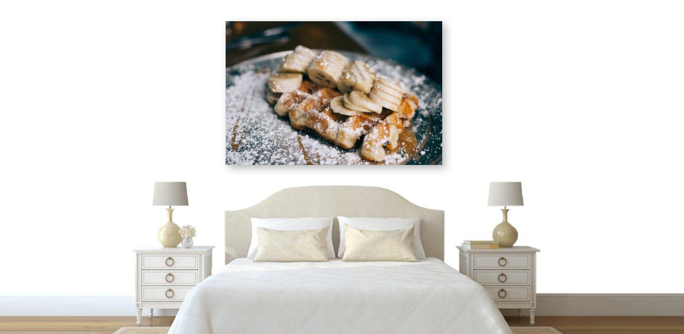
Those photos are absolutely key in allowing you to be comfortable enough to complete the purchase, and your art website is no different.
Live 3D Previews are critical, especially because they are the first thing your visitor will (or should) see when they land on a page displaying a specific art piece for sale.
Without it, the entire buying process will stop at that point for a majority of site visitors.
Without this feature, the other four won’t even matter. That’s why we’ve placed Live 3D Previews in the #1 spot.
Live Framing Previews

Frames are extremely important to offer for several reasons – one of them not so obvious, so make sure you don’t skip this section.
At Art Storefronts, our data shows that frames are sold with 15-20% of all art purchases.
For artists and photographers that don’t offer frames, that is a lot of money left on the table.
But as we learned before, simply offering frames in a dropdown menu is not enough, because there’s friction when it comes to buying frames. A potential art buyer is not going to feel comfortable spending the money on a frame that they can’t visualize.
The solution – you may have guessed it – is to offer a Live 3D Framing Tool.

With a live framing tool in place, customers are able to toggle through all of your frame options, seeing a live preview with each click of that frame on the art piece they are in the process of buying.
This visual experience allows them to make decisions on style, color, and texture, that would otherwise not be possible.
Consumers find this tool not only dazzling and incredibly helpful – but it’s also a critical friction-remover.
So let’s now talk about the not-so-obvious point about the value of a live framing tool, that you likely never thought of until now.
The live framing tool is a critical aide in helping consumers complete a buying decision, even if they don’t plan on buying a frame from your website.
Why?
Because they may plan on framing this piece of art. Or they may not. Ultimately, this piece of art is either going to be framed or not before it gets hung up on the wall. The customer is trying to imagine how it will look on the wall in the spot they have carved out for it. This called a desired outcome.
Your goal is to do everything you can to help them reach their desired outcome. The live framing tool therefore allows them to play with frames like an interior designer would, all the while toggling different styles and colors, with the goal of trying to get the buyer to that “this is what I want!” moment.
At the end of the day, your buyer may not be in love with your specific frame options. Or they may not be comfortable buying a frame from your website, as they may prefer to take the piece to a local framer. But none of this matters. Some of them will buy from you and that is a fact. But selling a frame is not the point here. Instead, the point is that the live framing tool was utilized as a means to get your buyer that much closer to their desired outcome.
All without leaving your website.
And when they reach their desired outcome, that’s when they make the purchase. Your website turned a complex decision into an easy one.

And a side-note, if you have aspirations to do business with interior designers or within the hospitality market (i.e.: boutique hotels), a live framing tool is an absolute must.
Interior designers have a lot of decisions to make, and your art is going to have to work for them on many levels.
This tool will make their life so much easier as they flip through your work, trying out different frames and looking for that “Aha” moment of finding the perfect combination.
The Wall Preview Tool

In terms of buyer friction, this is the final piece we need to overcome.
With features 1, 2, and 3, the buyer has had a chance to completely visualize their perfect piece of art.
Now there’s just one question left: How will it look in my living room?
Or office? Or bedroom? Or restaurant?
They love the piece, but is it right for the space it’s going to be hung?
Enter The Wall Preview Tool.
This tool produces the ultimate “This is what I want!” moments. There are two major points of friction this tool solves:
STYLE
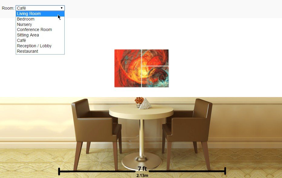
For many, art is an infrequent purchase, and they’re going to want to make sure they get it right.
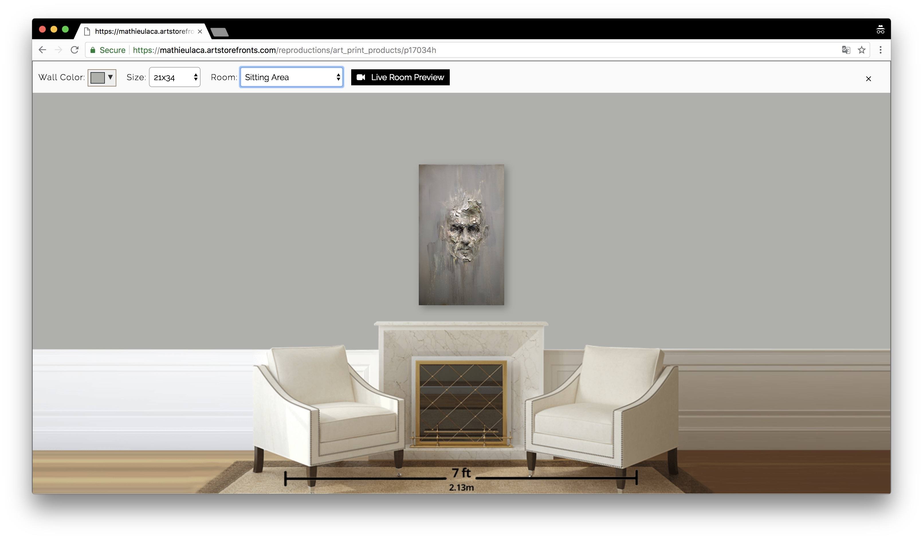
The Wall Preview Tool helps them visualize how the piece will look like by allowing them to select a room simulation – bedroom, office, and more – and apply their real world paint color to the room rendering.
This is a great way to see just how well a given piece, media type, and/or frame, is going to work in its final destination.
SIZE
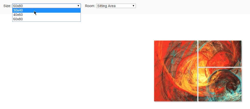
Remember when we mentioned taking terms like “canvas gallery wrap” for granted?
Size is another one of those problems.
Artists and photographers throw around commonly used sizes such as “16×20” and “36×48” not realizing just how little those numbers mean to a consumer that doesn’t deal with printed art regularly.
The Wall Preview Tool includes furniture in each room simulation that allows the buyer to get a powerful sense of scale.
This will remove friction (“I love the piece, but I’m just not sure what size to order, I think I’ll just go to an art store in person where I can get a better sense for how big it’s going to be”), and it also reduces returns from customers that order the totally wrong size for their space because they were never given a chance to visualize how large or small it was going to be.
Media Type Flexibility
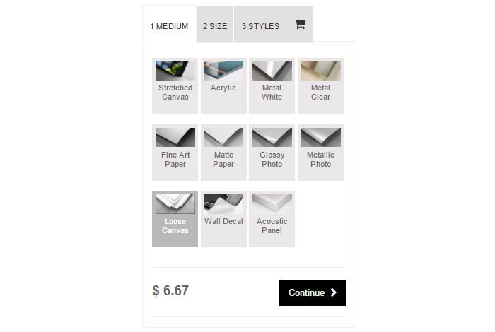
The image above shows an example of an “Exploded” List of Media Type Options.
In contrast, here is what most artist websites have, which is a simple dropdown menu with all the media type options trapped inside:
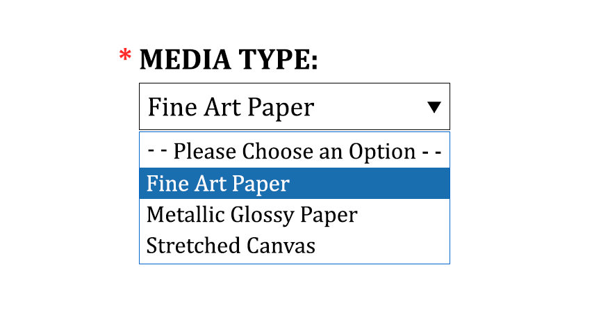
This is a seemingly small difference, but the impact between them is enormous.
In order to understand why a dropdown menu is so terrible, you need to see it from the vantage point of the impatient visitor who just landed on the buying page for one of your pieces.
With an exploded list, the visitor immediately sees – right when they land on the page – every single media type available with a small thumbnail image, and they didn’t have to click anything or do anything at all to see them.
It’s like laying all the cards out on the table, so your customer see them all at the same time, rather than stacking them all on top of each other and forcing your customer to flip through them one by one.
This is common sense merchandising applied to the digital art buying experience.
It goes further.
With the exploded list of media type options, your visitor can simply use their mouse to hover over any media type that looks interesting to them, and immediately see a full description, along with specifications and supportive images that show what the media type will look like as a finished print from the front, back, and sides.
In other words, with a simple mouse move (no clicks, no page changes) your visitor is immediately able to access all the information they need to make a buying decision for any media type – within seconds of landing on the page.

Ask yourself real quick – when a visitor lands on your website and is viewing an art piece, how different does it look like than what we are recommending above?
Now let’s dive into the friction that is created when you stuff media types in a dropdown menu.
The main issue with a dropdown menu, is that there is a high probability that your visitors will never even see all the media types you have to offer.
You can verify this by installing a website recording tool like Hotjar and watch recorded videos of your visitors using your website. We’re confident you will see only a small percentage ever use the dropdown menu.
Even fewer actually click each one. And even fewer read any of the supportive information you may have provided about each media type.
Meanwhile, to get this far they’ve had to hunt for options, click multiple times, and spend more time on the page than they probably wanted to.
All of this is a big problem when it comes to closing the art sale. But it can all be fixed by implementing an “Exploded” list of Media Types.
Finish Flexibility
Offer a print rolled up in a tube, gallery wrapped, matted, framed, or whatever options you want. By giving your customer flexibility, you increase conversion rates.
For example, too many artists force their customer to buy a gallery wrap when the customer only wants the print rolled up in a tube because they plan to get it stretched and framed themselves (and feel more comfortable doing so).
In a case like this, when you don’t offer a rolled up in a tube option, and instead force your customer to pay for a gallery wrap they don’t want or need, you simply lose out on sales.
Given the variety of consumer desires when they go to purchase any given print, you can’t afford to force your customers into boxes that you think they should fit into. Instead, your offering should reflect what THEY want.
Minimalist Design
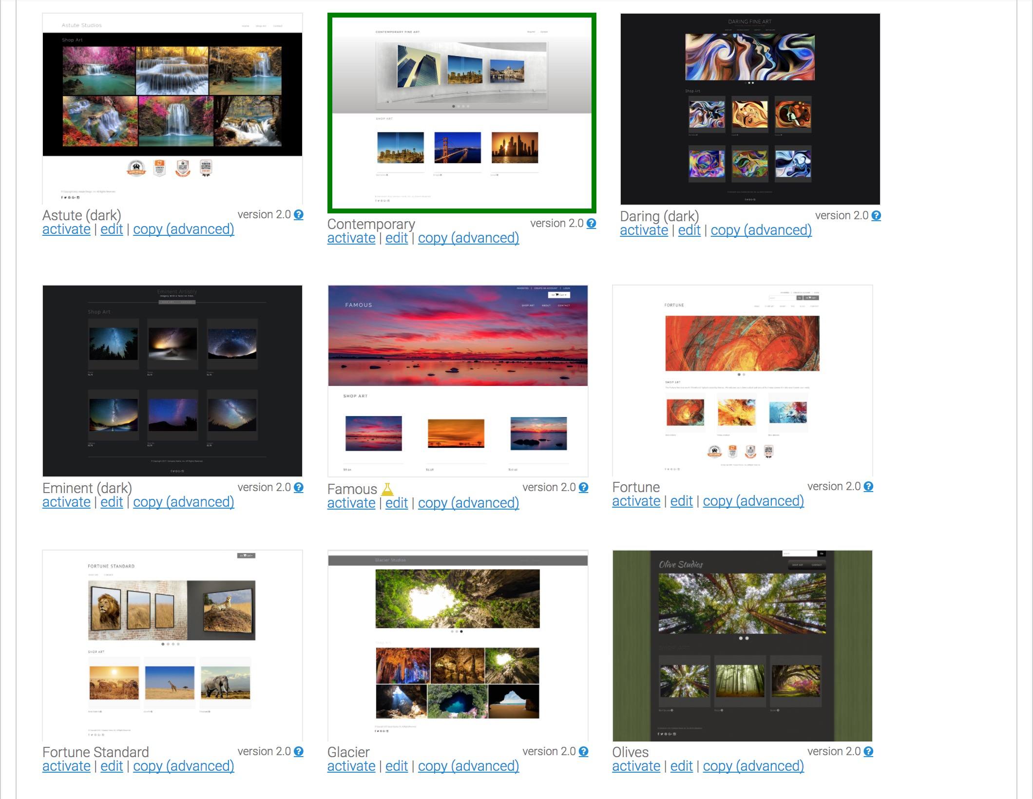
All of our website themes are thoughtfully designed using the minimalist design strategy. A main facet of minimalism is the concept of “less is more”, which is critical in the art industry.
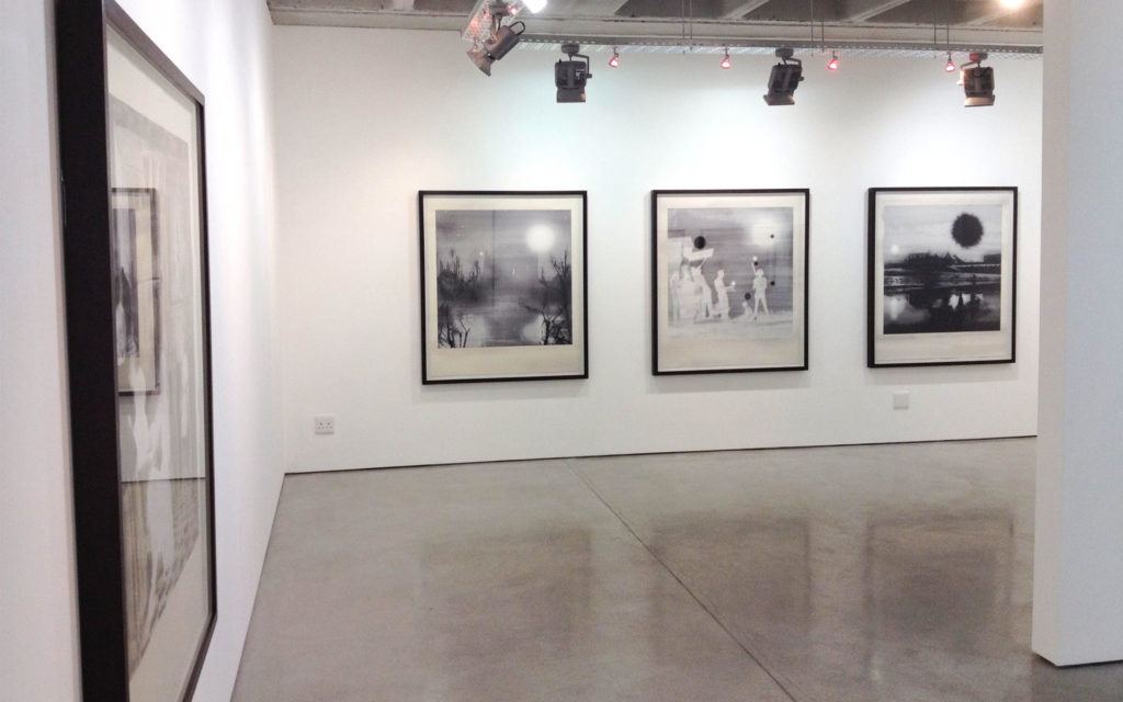
Minimalist design allows the main image on the page to take center stage with no other elements competing for attention. It is how most of our walls look where we hang art, and it is why museums have large white walls.
Let the image take center stage. Minimalist design with artistic websites keeps the customer undistracted and on the path to completing their purchase.
Single Page Checkout
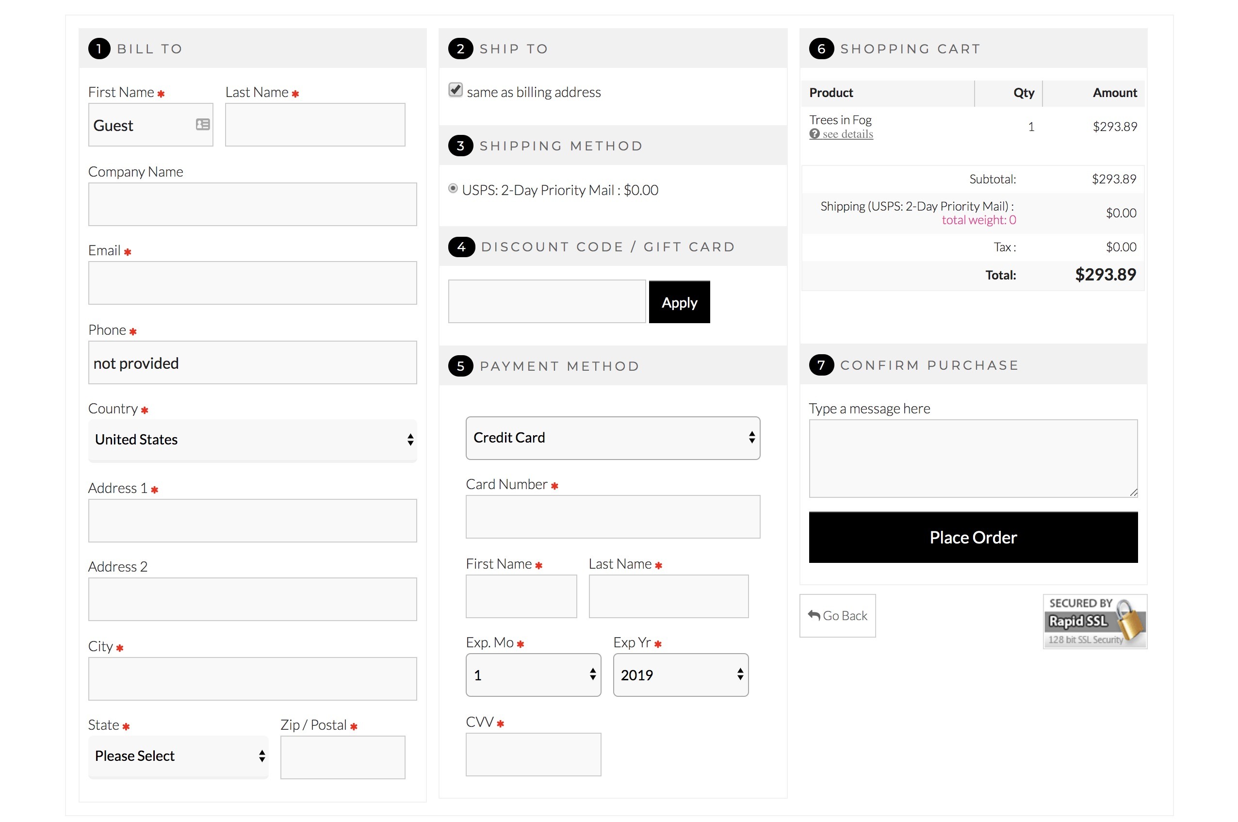
It’s all about less text, fewer clicks.
The internet is full of case studies that highlight the impact this simple change can have.
One of our favorites was run on the Vancouver 2010 olympic online store. They tested the single checkout page and found…
The single page checkout process was the clear winner and led to lower cart abondon rates. Successful completion rate for the entire checkout process increased by 257.26%. Overall site conversion rate increased by 0.54%. We also observed some unexpected improvements during this experiment, like an increase of 8.54% in the average order value!
The fewer steps you require your prospects to go through in order to checkout, the higher your conversion rates will be.
Rather than forcing your visitor to go through a series of steps to enter in their billing/shipping/credit card and select their shipping method, we do it all on one convenient page. This leads to less shopping cart abandonment, and therefore higher conversion rates.
Mobile Ordering
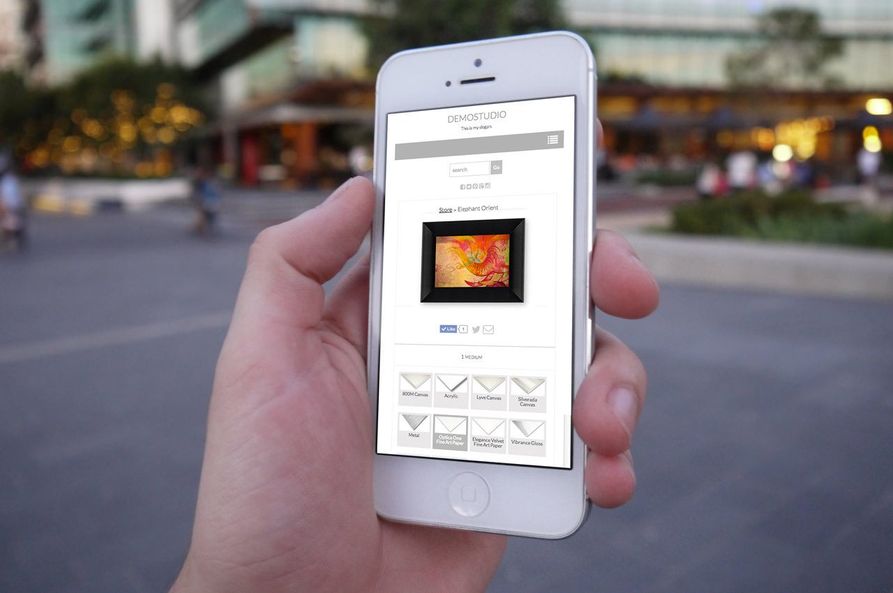
People are buying art and photography from mobile and tablet devices, and they’re doing it right on our members' websites.
This is a segment that is growing each and every day. If you don’t have mobile and tablet eCommerce capability, you’re losing every potential sale from shoppers using these devices. In other words, you have a 0% conversion rate with this ever-increasing audience!
Equally important, Google will actually penalize you on the search results page when your site is not up to mobile/tablet standards.
Your Art Business in 3 Years
So - what will it be like? Will it produce the same income it does today, or something much better?
As Steve Jobs put it, it takes 3-5 years to build anything meaningful.
This means that the decisions you make today will impact your life 3-5 years from now.
As such...if you’re still on the fence about what the next step is to grow your art sales, here’s some simple advice that we pass along to everyone:
If you have at least sold a decent amount of your art or photography to complete strangers, you’ve already proven that you have a real product and a real business.
This means you’re ready for the next step – which is to open your own art gallery business online.
If you only have a little time to devote to it, you can run it as a side business. You probably already spend time on something related to your art business (like reading this). Why not spend a couple hours a month to slowly build your art own art gallery business?
The best case scenario is you do it, you put in the work, you get the right features, and in 3-5 years you have a really great business you can live off of for decades to come.
Worst case scenario you give it a try, it doesn't work out, and your life goes back to where it is right now.
There’s only one way to find out.
Want to talk it over with one of our success coaches?
Request a Demo and see why thousands of photographers and artists run their businesses with Art Storefronts »
