art storefronts themes

Major Design Updates – Introducing Themes 2.0

Introducing ASF Themes 2.0 – a major update to our theme collection that includes two sleek, modern themes that take advantage of the full width of monitors and make your images look great.

Three words to describe the new Sleek theme..

Simple, clean and minimalist.

When you’re selling art online, you want to place all of the focus on your images.

It’s important, therefore, to make sure your website’s design is simple and clean enough to keep the viewers’ focus on those images.

This was our thinking when we created these beautiful, new themes that put your images front and center with presentation based on the very latest standards in web design.

ecommerce modern design

Take advantage of the new, full width billboard. Surprise users with a handy and modern ride-along navigation bar that stays with them as they scroll.

It’s all fully responsive to make for an incredible experience on desktops, tablets, and mobile phones alike.

And that versatile experience is important! Our stats show us that many of our most successful artists are heavily leveraging social media – especially Facebook and Instagram – to drive traffic to their sites.

So what does that mean? That means mobile traffic.

When the smart phone wielding, thumb swiping masses of social media click a post or ad you want to make sure you are looking your best.

So what % of your traffic is coming from mobile users?
Do you know how to check?

2016-03-25-sleek-theme-google-analytics

Jump into Google Analytics and take a look.

Go to Audience > Mobile > then Devices. Then look at the % in the upper left hand corner.

2016-03-25-mobile-traffic

For us here on the ASF Blog, it’s 35% in the last 30 days. Last month it was over 50%.

For some of our most successful artists, we have seen up to 60% at times.

So looking amazing on mobile is not an after thought anymore, it’s a priority.

2016-03-25-mobile-devices

We are happy to report that the new ASF 2.0 Themes were designed from the ground up to offer an amazing and functional mobile experience.

And, most importantly… it converts.

Want to take a look for yourself? Check out Sleek and Sleek Dark.

How to Implement Themes 2.0

If you are a current customer and want to switch to one of these new themes, please see our article on How to Migrate from ASF Themes 1.0 to 2.0.

Leave a Comment:

Dominique Hurley says

I can’t get to your link for the migration. I get the error on the screen shot below.

Reply
Art Storefronts says

Click advanced and you should be good. Its a desk.com thing which is our support system.

Reply
Ray says

I just changed over and added the slippery billboard but now my page is too big to view all at once even on my 27″ iMac.
OK…I guess I have to resize the images to be almost panoramic?

Reply
Art Storefronts says

Hey Ray. Open a ticket with support and let them have a look. Should be able to get you sorted.
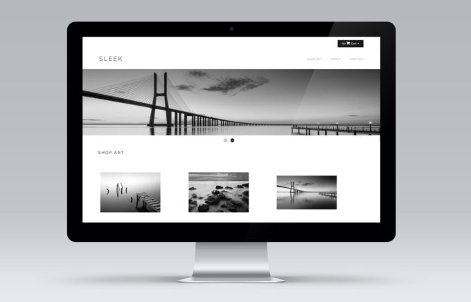
Reply
Dave Sansom says

I grabbed Sleek as soon as I got the note that it was available. I love it! It looks great from my idMac 27″ to my iPhone. Works great. Very smooth. I did have to prep new files for my billboards. 960 pixels wouldn’t cut it. I changed to 1700 pixels and compressed them to 175kb to 250kb and don’t notice any slow loading. I also want to thank you guys at ASF for the great support. I’m excited to launch!

Reply
robertlott says

I tried the new themes and slippery billboard, but found these to be more suited for panorama style images. Since almost all of my images have an aspect ratio of 1.5, matching my camera, the slippery billboard just did not work for me. The images in the billboard were not clickable, either.

Reply
Art Storefronts says

Robert I think you are stuck in the theme 1.2 vs 2.0 gap. Contact support and let them know your issues. They can help you get it all sorted.

Reply
robertlott says

What do you mean by theme 1.2 vs 2.0 gap? I changed to the 2.0 Sleek Dark theme and the slippery billboard and was not impressed. These updates seem to be suited to wide images not those with an aspect ratio of 1.5 which most of mine are. The result was too much vertical space compared to the “Midnight (Dark)” theme I was using. I also did mot like the menu across the top with the new themes and I found that clickable links with the slippery billboard did not work.

Just not worth it!

Reply
Add Your Reply

x

Sell More Art Online

If we can't teach you, no one can!